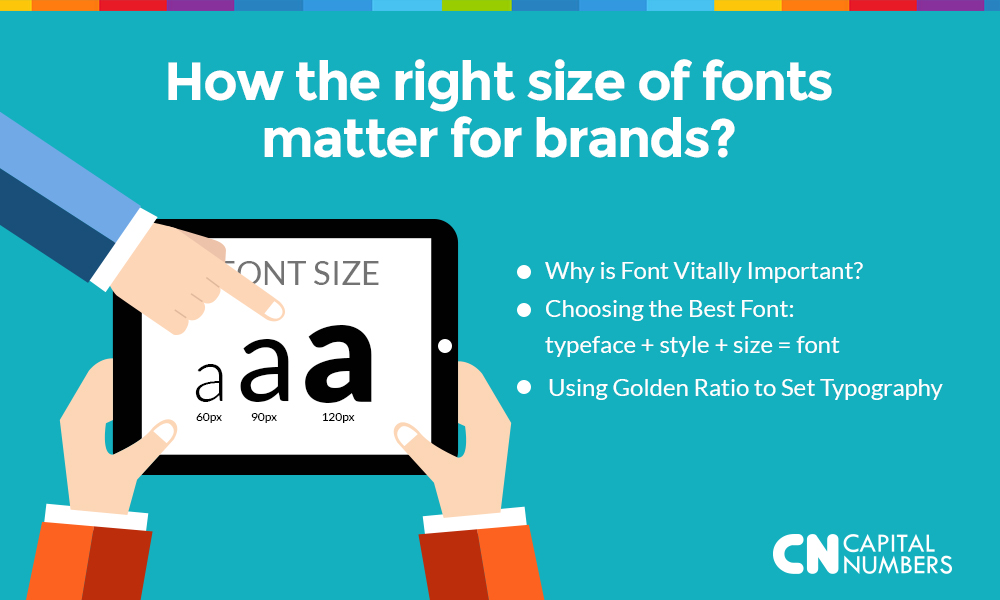
How the right size of fonts matter for brands?
Table of Contents
Have you ever thought why fonts are so vitally important? Yes, you read it right – choosing the right font is one of the most critical tasks of a designer.
Think about the way you dress-up. Based on what you wear, people assume your sense of style, your age, your personality. Clothes leave the strongest impression of you. So is the case with fonts. The first thing that people do after visiting is website is start reading the content. So, the fonts you choose must serve the purpose – it must be reader friendly for any screen size.
Is your font saying about “pizza parlor” when it should be talking of “a hospital”? As a designer have you ever thought of this? What is the main goal of the font you choose? Is it for your brand to communicate with your customers?
Yes. In simple words, the main purpose of a font is to be read. If it can be read, it solves half your business issues. It must be easy for your customers to read the content of your website without any difficulty.
So, how would you define a perfect font?
Simply, a font that is EXTREMELY easy to read and not a font that just looks artistic. Your font can either make your visitors spend longer time on your website or simply leave in seconds.
It is very important to know that there is not just one right font. There are group of fonts, which can be broadly divided into two categories:
- Simple font
- Fancy fonts
To know which could be the right font for your website, it is very important for you to understand your target market and the psychology behind each font.
A simple experiment was carried out by Hyunjin Song and Norbet Schwartz, two researchers. Two groups of people were given two directions – one written in simple font and another in fancy. The first group that received their direction in simple font assumed to finish their task in less than 10 minutes, whereas the other group gave an estimation of a little over 15 minutes. One the tasks were completed, it was found that the first group took 86% more time than they estimated. The outcome of this experiment showed that when people find something easy to read they assume it to be easily achievable.
Another experiment was taken out with the same group of people. They were again divided into two groups. While one was given a restaurant menu written in fancy fonts, the other received the menu printed in simple fonts. Here the result was very different from the earlier experiment. The group with the menu written in fancy font assumed the food to be of great taste and the chef to be more skilled.
The above two experiments clearly shows that choosing the font mainly depends upon the purpose of your business.