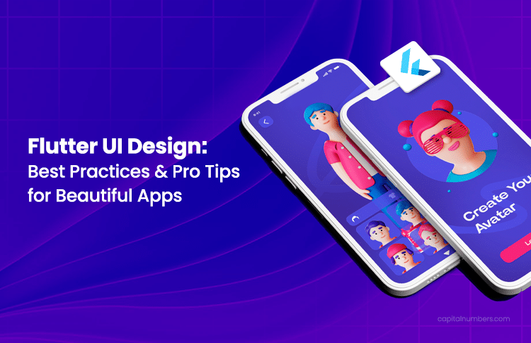
Flutter UI Design: Best Practices & Pro Tips for Beautiful Apps
Table of Contents
When it comes to mobile apps, the first impression is crucial. Users expect intuitive, polished interfaces that feel effortless to navigate. An inconsistent UI can lead to instant drop-off, no matter how powerful the backend is.
That’s where Flutter shines. As Google’s cross-platform UI toolkit, Flutter allows developers to create stunning, high-performance apps that work seamlessly across both Android and iOS. With its customizable widgets and fast development cycle, Flutter makes it easier than ever to build beautiful, responsive UIs that engage users without compromising on performance.
In this blog, we’ll share tips and tricks to help you improve your mobile UI – from using prebuilt widgets and material design to adding smooth animations and making your app more accessible. Whether you’re building your first app or refining an existing one, these ideas will help you create a better user experience.
Understanding Flutter’s Design Capabilities
Flutter’s power lies in its widget-first architecture. Everything in Flutter – from layout to styling to interaction – is built using widgets. This modular approach simplifies UI development by allowing you to compose complex interfaces from small, reusable building blocks.
Flutter’s Widget System: Simplifying UI Design
Flutter’s widget-based architecture makes UI design straightforward. Widgets in Flutter are the building blocks for creating interactive user interfaces, each with its own properties and behaviors.
StatelessWidget is used when a widget’s configuration does not depend on mutable state stored in the widget itself. Use StatelessWidget for purely declarative, configuration-driven UI; when the UI needs to react to ephemeral, local changes (for example, animation controllers, focus nodes, or local counters), use StatefulWidget or an external state manager.
StatefulWidget holds mutable state that affects the widget’s appearance or behavior and can call setState to rebuild. For small, local UI state, setState inside a StatefulWidget is fine. For app-level state or complex flows, prefer an external state-management solution such as Provider, Riverpod, or Bloc to keep logic testable and reduce unnecessary rebuilds.
Flutter offers a variety of layout widgets for arranging UI elements. Basic widgets like Row, Column, and Container help organize and position elements horizontally and vertically. For more advanced layouts, Stack allows you to layer elements, ListView creates scrollable lists, and CustomPaint lets you create custom graphics. This flexibility empowers developers to design everything from simple interfaces to complex, interactive UIs.
This widget-centric approach simplifies UI development by making components composable and reusable, saving developers time when building scalable apps.
You May Also Read: How to Create and Add Home Screen Widgets in a Flutter Mobile Application
Key Flutter Features for Intuitive UIs
- Hot Reload
Flutter’s hot reload feature is a game-changer for UI design. It updates Dart code and most of the running widget tree instantly, so you can fine-tune layouts and styles quickly. But changes to native platform code, plugin initialization, or certain stateful services require a hot restart or a full rebuild. - Custom Widgets
Flutter enables the creation of custom widgets, which can be tailored to your app’s specific needs. By composing smaller, reusable components rather than creating deep widget hierarchies, developers can improve readability and performance. Custom widgets allow you to design unique elements, like buttons, cards, or navigation bars, that fit your app’s brand and user experience.When used properly, custom widgets can also enhance UI performance. They make it easier to manage the complexity of your app by breaking down large components into smaller, manageable parts. This approach not only makes the code more maintainable but also reduces unnecessary re-rendering, which improves app performance.
- Animation Support
Smooth animations are crucial to a dynamic user experience, and Flutter shines in this area. The framework offers a rich set of pre-built animations (like AnimatedContainer, FadeTransition, and Hero), as well as the ability to create custom animations with precision. Flutter’s built-in support for animations ensures that adding transitions, effects, and motion to your app is both intuitive and performant.
With these features, Flutter gives developers all the tools they need to design engaging, responsive, and beautiful UIs. Whether you’re fine-tuning a layout or adding interactive elements, Flutter’s capabilities make it easy to build modern apps that users love.
Hire skilled Flutter developers from Capital Numbers to create stunning, high-performance UIs that engage users and enhance their experience. Our experts specialize in building responsive, scalable, and visually appealing mobile apps using Flutter’s powerful design capabilities. Let’s turn your vision into a seamless mobile experience.
Flutter UI Design Tips for Beautiful Mobile UIs
Creating a visually appealing UI in Flutter is crucial for delivering an engaging user experience. With the right design principles and Flutter UI components, you can build sleek, responsive, and intuitive interfaces for mobile apps. Below are key Flutter UI design tips and tricks to help you make the most of Flutter’s capabilities and create stunning UIs that will captivate users.
1. Use Flutter’s Prebuilt Widgets
One of the key strengths of Flutter UI design is its rich collection of prebuilt widgets. These Flutter UI components are versatile building blocks that can be used to quickly create responsive, dynamic layouts without the need for custom coding from scratch.
Commonly used widgets like Container, Column, Row, and Stack serve as the foundation for most Flutter apps:
Container:
A simple yet powerful widget that allows you to style and position other widgets. It’s ideal for adding padding, margins, borders, and backgrounds, helping you design a clean layout.
Column and Row:
These layout widgets help you arrange elements vertically and horizontally, respectively. They are essential for building structured layouts, from simple forms to complex app interfaces.
Stack:
Allows you to layer widgets on top of each other, creating intricate designs and animations, perfect for backgrounds or overlapping UI elements.
By using these prebuilt widgets, you can maintain a consistent, clean layout while following Flutter UI best practices. These widgets also contribute to beautiful UI in Flutter, enabling you to create mobile UI designs that are flexible and responsive across various screen sizes.
2. Utilize Material Design Principles
Material design is a design system created by Google, focusing on creating clean, user-friendly, and consistent interfaces. Flutter makes it easy to implement these Flutter UI design principles, allowing you to build beautiful UIs in Flutter that are functional and visually appealing.
Different Material Components in Flutter
Flutter offers several material UI components that help you design a polished, consistent UI. Some commonly used components include:
- Buttons: Flutter provides ElevatedButton, TextButton, and IconButton, making it simple to create interactive, stylish buttons that follow Material design guidelines.
- Cards: The Card widget groups content in a visually appealing way, helping to organize information and create hierarchy in your layout.
- Sliders: The Slider widget is perfect for allowing users to choose values within a range, making the interface more interactive and engaging.
How Material Design Improves UI Consistency and User Experience?
When you use material design principles in Flutter, your app will benefit in several ways, including:
- Consistency: Material design ensures your app has a cohesive look across different platforms, making it easier for users to navigate. This is crucial for apps targeting both iOS and Android.
- Ease of Use: By using standard components like buttons and sliders, users find it easier to interact with your app, improving the overall experience.
- Responsive Design: Material design components adjust automatically to different screen sizes, ensuring your app looks great on any device.
By following Flutter UI best practices and using material design, you can create a polished, intuitive app that delivers a seamless experience for your users.
How We Built a Super Grocery Application with Flutter
The client had a bold vision – one super app to handle everything from grocery shopping to gaming. But the challenge was clear: combining all these services into a single app could lead to slow performance and a frustrating user experience.
Learn how we built a fast, seamless super app using Flutter, React, and combining Progressive Web Apps (PWAs), AI tools, and smart caching to ensure smooth performance with no delays. [Read the full case study here]
3. Work with Custom Themes
Flutter allows you to create custom themes, which gives you full control over your app’s visual identity. This is essential for achieving a beautiful UI in Flutter and ensuring a consistent user experience throughout your app.
What are Custom Themes in Flutter?
Flutter makes it easy to create a cohesive look by defining custom themes that include color schemes, typography, and iconography. You can define a global theme for your entire app, ensuring that all components, such as buttons, text, and background colors, remain consistent. For example, you can set primary and accent colors, choose font families, and even customize button styles using the ThemeData widget.
Importance of Consistency
When designing a mobile UI with Flutter, maintaining consistency is key. A unified color scheme, well-chosen typography, and aligned iconography help create a smooth, visually appealing experience. Consistent design builds trust and makes your app more intuitive for users, as they can easily recognize elements and actions throughout the app.
- Color Schemes: Select a palette that aligns with your brand and use it consistently across your app.
- Typography: Choose legible fonts that fit the tone of your app and ensure they are used consistently.
- Iconography: Use a uniform set of icons that match the overall design, ensuring they fit seamlessly into your layout.
Reusable Theme Settings
One of the best practices in Flutter UI design is creating reusable theme settings. Here is what you need to do:
- Define a central theme for your app to ensure uniformity across all screens.
- Changes to the theme are automatically reflected across the app, making updates easier and more efficient.
By using Flutter UI customization and creating custom themes, you ensure a polished, cohesive look that enhances the user experience.
4. Master Layouts and Responsiveness
Creating responsive layouts is essential for building a beautiful UI in Flutter that adapts seamlessly across various screen sizes. With the right tools, you can ensure your app looks great on all devices, providing a consistent and fluid user experience.
Best Practices for Responsive Layouts
Designing for different screen sizes means considering flexibility in your layout. A few key best practices include:
- Prioritize fluid, scalable components that adjust based on screen size.
- Use layout techniques that adapt to different orientations and screen resolutions.
How to Use MediaQuery to Handle Different Screen Sizes?
MediaQuery provides critical information about the device’s screen size, orientation, and pixel density, helping you create layouts that fit any screen. With MediaQuery, you can:
- Adjust element sizes, margins, and padding based on the available screen space.
- Create responsive text and button sizes for better accessibility across devices.
How to Use LayoutBuilder and Flex for Dynamic Layouts?
LayoutBuilder gives you constraints and allows you to build layouts that adapt based on the available space. Flex widgets like Row and Column can help create dynamic layouts that resize based on screen width and height. Here’s how to use them effectively:
- Use LayoutBuilder to build widgets that respond to the changing layout.
- Use Flex widgets with Expanded or Flexible to create scalable elements that adapt fluidly to different screen sizes.
How Flutter State Management Helps with Responsiveness?
Efficient Flutter state management ensures that your app stays responsive, especially when dealing with changing data. Proper state management allows for:
- Efficient UI updates: Ensures only the necessary widgets are rebuilt when data changes, improving performance.
- Smooth user experience: Prevents UI lag and delays by keeping the UI in sync with the app’s state.
- Consistent behavior: Helps maintain a predictable and responsive UI as the app grows in complexity.
How to Ensure Adaptive and Fluid UI Components?
To maintain consistency and usability across various devices, it’s crucial to make your UI components adaptive:
- Scale text, buttons, and images proportionally across screen sizes.
- Ensure that interactive elements maintain usability, regardless of screen resolution.
By following these Flutter UI design principles for responsiveness, you can build adaptive layouts that work flawlessly across all devices, ensuring a seamless user experience.
5. Add Smooth Animations and Transitions
Animations are a powerful tool for making your app feel interactive and engaging. When done right, smooth animations enhance your beautiful UI in Flutter, creating a more enjoyable user experience.
Importance of Animations in Creating Engaging UIs
- Animations help create a sense of fluidity, making interactions feel more natural and intuitive.
- They can also emphasize transitions between screens, improving the user’s journey and making the experience more enjoyable.
How to Use Flutter’s AnimatedContainer, Hero, and FadeTransition?
Flutter UI components offer several ways to implement animations that bring your app to life.
- AnimatedContainer: Easily animate changes in size, shape, and color of widgets, providing smooth transitions that keep the UI dynamic.
- Hero: A powerful widget for creating seamless transitions between screens by animating shared elements, making navigation feel more connected.
- FadeTransition: Use this to smoothly fade in or fade out widgets, which is perfect for screen transitions and subtle effects.
Tips for Using Animations without Compromising Performance
While animations enhance user experience, it’s important to use them wisely to optimize performance. Here are some tips:
- Avoid overusing animations, as too much motion can slow down the app and overwhelm the user.
- Follow concrete animation performance practices: use implicit animations (AnimatedContainer, AnimatedOpacity) for simple transitions, and an AnimationController with Tween/AnimatedBuilder for complex sequences.
- Avoid heavy per-frame operations on the main thread; precompute values off the UI thread, reuse animation controllers where possible, and prefer composited effects (Opacity, Transform) over rebuilding subtrees.
- Consider Lottie for designer-made animations to offload the framework to optimized renderers.
Adhering to these Flutter UI design principles for animations, you can create an engaging and responsive app that feels modern and fluid, all while maintaining high performance.
6. Improve UI Performance with Lazy Loading
Lazy loading is a great way to improve your app’s performance, especially when dealing with large lists or complex screens. By loading only the items that are visible to the user, you can reduce memory usage and speed up the app.
How to Implement Lazy Loading in Flutter?
- Use ListView.builder (or SliverList with CustomScrollView) for long lists so items are built lazily. For large or paginated lists, combine ListView.builder with a ScrollController and a paging strategy (or use packages like infinite_scroll_pagination) and cache previously loaded pages. Also prefer const constructors for list item widgets and avoid expensive work inside build() to minimize jank.
- For asynchronously loading data, consider using FutureBuilder in combination with ListView.builder. FutureBuilder helps load data incrementally, which is especially useful when dealing with large data sets.
Benefits of Optimizing UI for Faster Loads and Smoother Scrolling
- Faster Load Times: Lazy loading ensures that your app doesn’t waste resources loading unnecessary content, making the app start faster.
- Smoother Scrolling: By loading items dynamically, you reduce lag and create a smoother scrolling experience for the user.
- Improved User Experience: Faster, more responsive interfaces lead to happier users and better app retention.
By implementing lazy loading, you can follow Flutter UI best practices to optimize your app’s performance, ensuring fast load times and a seamless user experience.
7. Image Handling and Caching in Flutter UI
Efficient image handling is critical for optimizing both performance and user experience in your Flutter app. By using appropriate techniques to load and cache images, you can reduce memory usage, improve load times, and create a smoother app experience.
How to Implement Image Handling and Caching in Flutter?
- Use cached_network_image for Remote Images
- Purpose: Caches remote images locally after the first load, reducing network calls and improving subsequent load times.
- Implementation: Simply use the CachedNetworkImage widget to load and display images from a remote URL with built-in caching support.
- Preload Images for Hero/Shared Images
- Purpose: Ensures images are loaded before being displayed, especially useful for hero transitions and images shared between screens.
- Implementation: Use the precacheImage function to load images into memory ahead of time, ensuring they’re available when needed.
- Use WebP for Smaller File Sizes
- Purpose: WebP format offers better compression without sacrificing image quality, reducing file sizes and improving load times.
- Implementation: Convert images to WebP on the server or use the flutter_webp package to load WebP images within your app.
- Use flutter_svg for Scalable Vector Icons
- Purpose: Scalable vector graphics (SVG) are resolution-independent and use less memory compared to bitmap images, especially on high-DPI screens.
- Implementation: Use the flutter_svg package to load SVG images, ensuring they are crisp and scalable across different screen sizes.
- Optimize Memory and Decode Costs for Large Images
- Purpose: Large images can consume a significant amount of memory, impacting performance. Resize images server-side and handle them efficiently in memory.
- Implementation:
- Resize images server-side before sending them to the app.
- Use Image.memory for handling binary image data directly from memory to reduce disk I/O.
Benefits of Optimizing Image Handling and Caching
- Reduced Load Times: Efficient caching and image preloading ensure images are displayed faster, enhancing the overall speed of your app.
- Lower Memory Usage: By using formats like WebP and SVGs, you reduce the memory footprint of images, ensuring better app performance.
- Improved User Experience: Faster image loading, seamless transitions, and high-quality visuals contribute to a smoother, more enjoyable user experience.
By following these best practices for image handling and caching, you can enhance your Flutter app’s performance and deliver a more responsive, visually appealing experience to users.
8. Accessibility Features in Flutter UI
Making your app accessible to all users is a key part of creating an inclusive and user-friendly experience. Accessibility features ensure that everyone, including users with disabilities, can navigate and interact with your app.
Importance of Accessibility in UI Design
- Screen Readers: These tools help visually impaired users by reading out text and describing UI elements.
- Color Contrast: Ensure there’s enough contrast between text and background for users with color blindness or visual impairments.
Flutter’s Tools to Enhance Accessibility
- Semantics: The Semantics widget in Flutter allows you to add important accessibility information to your UI, like labeling buttons and describing actions, for screen readers.
- Accessibility Features: Flutter offers built-in support for screen readers, large text, and high-contrast themes, making it easier to create apps that everyone can use.
By integrating Flutter UI design principles for accessibility, you create a more inclusive app, improving the experience for all users, regardless of their abilities.
9. Testing and Iteration
Testing and iteration are essential for refining your Flutter UI design and ensuring a seamless user experience. Flutter provides powerful tools to help you test, evaluate, and improve your app’s UI.
How to Use Flutter’s Testing Framework to Evaluate the UI?
- Flutter offers a comprehensive testing framework that includes unit, widget, and integration tests.
- Use widget tests to check if UI components behave as expected and integration tests to verify that the whole app works smoothly.
- Use the integration_test package (flutter.dev recommended) for end-to-end tests and flutter_test for widget/unit tests. Flutter Driver is deprecated. For visual regression testing include golden tests, and run integration_test in CI (emulators or device farms) to verify complex flows.
Tips for User Testing and Iterating on Designs?
- Gather User Feedback: Conduct usability tests with real users to identify pain points and areas for improvement.
- Iterate Based on Insights: Use feedback to make informed design changes, testing new iterations to see if they improve the user experience.
- Focus on Usability: Ensure the app is intuitive and easy to navigate, making necessary adjustments based on user interactions.
By integrating Flutter UI best practices for testing and iteration, you can continuously improve your design, creating an app that’s both functional and enjoyable to use.
Bottom Line
Creating a beautiful UI in Flutter is easier than you think. By following these Flutter UI design tips, you can build an app that’s not only visually appealing but also smooth and easy to use. Use the right layout tools, add animations, optimize performance, and focus on accessibility. Keep testing and refining based on user feedback. Flutter gives you everything you need to design an app that stands out. So, start building, get creative, and watch your ideas come to life with Flutter!
Why Choose Capital Numbers for Flutter Development Services?
At Capital Numbers, we deliver top-quality Flutter development services to help bring your app ideas to life with beautiful UIs and smooth user experiences. Here’s why you should choose us:
- Expert Flutter Developers: Our team has extensive experience in building responsive, scalable, and visually appealing apps using Flutter’s best design principles.
- Fast and Efficient: We focus on delivering high-performance apps that run smoothly across devices, with quick load times and seamless navigation.
- AI-Powered Workflow: We use AI-assisted developer tools (for example, Cursor – a commercial AI code assistant) and production-ready AI services to accelerate development cycles and enhance usability.
[Note: these are third-party commercial tools and not Flutter-specific libraries.] - Future-Ready Apps: Our solutions are built to scale, adapting to your growing business needs while maintaining top-notch quality.
Ready to start? Schedule a consultation today and let’s turn your vision into reality!

 Web Development
 Cloud Engineering
 Mobile App Development
 AI/ML/GenAI
 E-commerce
 Software Development
 UI/UX
UI/UX QA
QA Dedicated Teams


