
Figma to Frontend: Best Practices for Smoother Design Delivery
Table of Contents
During a recent product sprint, our team ran into a familiar challenge.
The design team had delivered beautiful UI screens in Figma. Everything looked perfect visually. But when the frontend team started implementing the design, questions began to appear almost immediately.
“What is the spacing between these cards?”
“Is this the same button component or a new one?”
“How should this behave on mobile?”
Soon the sprint slowed down. Developers started making assumptions. Designers were pulled into constant clarification meetings. Small inconsistencies began to appear in the UI.
The problem wasn’t the design. And it wasn’t the code either.
The real issue was the process between Figma and frontend development.
In modern product teams, tools like Figma shape the design process, while frameworks such as React, Vue, Angular, and modern CSS systems bring those designs to life. The real challenge, however, lies in how clearly and consistently those design ideas translate into code.
Over time, we realized that a smooth Figma-to-frontend workflow doesn’t happen automatically. It needs structure, clarity, and collaboration.
Here are the practices that helped our team transform design handoffs from chaotic to predictable.
Start with a System, Not Screens
Early in our projects, designers often started with the most exciting part, designing screens.
Landing pages. Dashboards. Product cards.
But developers were not thinking in screens. They were thinking in components, design tokens, and reusable structures.
That difference in mindset created friction.
Designers usually focus on:
- Layout
- Visual hierarchy
- Aesthetics
- User flow
Developers, on the other hand, think about:
- Components
- Reusability
- States
- Responsive behavior
Instead, we started with a Design System Foundation. Before designing a single page, we defined core design tokens inside Figma.
These included:
- Color variables (Primary, Secondary, Success, Warning, Neutral)
- Typography scale (H1–H6, Body, Caption)
- Spacing scale (4px / 8px grid system)
- Border radius tokens
- Shadow styles
- Grid layout system
All of these were defined using Figma Variables or Styles, not manual values.
The biggest advantage appeared on the frontend side.
Design tokens could map directly to CSS variables.
Example:
Figma tokens
Primary Color: #3B82F6
Spacing-4: 16px
Border Radius: 8px
Frontend
:root {
--color-primary: #3B82F6;
 --spacing-4: 16px;
 --radius-md: 8px;
}
Once we introduced token-based design, we noticed something interesting:
UI inconsistencies dropped by almost 30–40%.
Because everyone was now speaking the same system language.
Use Auto Layout Like Developers Use Flexbox
Another major improvement came from how designers used Auto Layout in Figma.
Initially, many layouts were created using manual positioning. Elements were placed exactly where they looked right visually.
But front-end developers don’t work that way. They rely on layout systems like Flexbox and Grid. So we started treating Auto Layout as the design equivalent of Flexbox.
Designers began to:
- Avoid absolute positioning unless necessary
- Use container padding
- Use gap instead of manual spacing
- Define vertical and horizontal stacking properly
From the developer’s perspective, this translated almost directly to:
display: flex;
gap: 16px;
justify-content: space-between;
align-items: center;
The result?
Layouts became easier to implement, and developers spent far less time adjusting margins or overriding CSS.
Component-Driven Design Equals Component-Driven Development
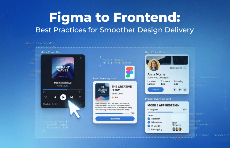
Modern frontend architecture is built around components. React components. Vue components. Angular components. But sometimes design files contained multiple versions of similar elements.
For example, the team once discovered 15 slightly different buttons across screens.
Same idea. Slightly different styles.
Developers then faced a difficult choice:
- Hardcode multiple variations (bad practice), or
- Ask designers to standardize them.
That’s when we started following component-driven design inside Figma.
Every UI element became:
- A reusable component
- Variant-based
- State-aware
For example, a button component included variants such as:
Style Variants
- Primary
- Secondary
- Outline
State Variants
- Default
- Hover
- Active
- Disabled
Size Variants
- Small
- Medium
- Large
Using Figma Component Variants, designers could manage all these options inside one structured component.
This mirrored how developers built components in code. And suddenly the design and development layers aligned perfectly.
Document Interaction and States Clearly
One of the most common causes of developer confusion was missing UI states. Designs often showed only the default appearance of elements. But real interfaces have multiple interaction states.
For example, a simple input field might include:
- Default state
- Focus state
- Error state
- Success state
- Disabled state
- Placeholder styling
Without these definitions, developers had to guess. And guessing rarely produces the right result. So designers started documenting states clearly for components like:
- Forms
- Dropdowns
- Buttons
- Inputs
- Modals
Now developers could implement interactions confidently without interrupting designers mid-sprint.
Define the Responsive Strategy Early
Another common issue appeared during mobile development. Designers sometimes created only desktop screens, expecting developers to figure out the rest. But responsive behavior isn’t always obvious.
To avoid confusion, the team began designing at three key breakpoints:
- Desktop (1440px or 1280px)
- Tablet (768px)
- Mobile (375px or 390px)
More importantly, we documented responsive behavior, not just layouts.
For example:
- Cards stack vertically below 768px
- Sidebar collapses to icon-only navigation
- Tables convert into accordion layouts on mobile
Using Auto Layout constraints, designers ensured that layouts adapted logically instead of creating completely different designs for every screen size.
This clarity significantly reduced back-and-forth discussions.
Naming Conventions Matter More Than You Think
At one point, developers opened a design file and saw layer names like:
- Rectangle 21
- Frame 104
- Group 6
It became nearly impossible to understand which elements corresponded to which components. That’s when we introduced structured naming conventions. Instead of generic names, elements were labeled clearly:
- btn-primary-md
- input-text-default
- card-product-default
These names mapped directly to frontend component structures.
When naming aligned across design and development, both teams effectively started speaking the same language.
Introduce a Design Handoff Checklist
Even with improvements, occasional issues still slipped through during handoff. So the team created a simple but powerful solution: a pre-handoff checklist.
Before marking a design as “Ready for Dev,” designers verified:
Design Checklist
- Components are reusable
- Interaction states are defined
- Tokens are applied (no hardcoded colors)
- Spacing follows the grid system
- Responsive layouts are included
- Icons are exported as SVG
- Images are optimized
- Fonts include fallback definitions
Developers also followed their own checklist:
Developer Checklist
- Tokens mapped to CSS variables
- Component architecture aligned
- Accessibility reviewed
- Performance considerations evaluated
- Reusable utility classes created
This checklist prevented many surprises during sprint reviews.
Use Dev Mode and Inspection Wisely
Figma’s Dev Mode introduced powerful inspection tools for developers. Spacing, typography, and layout details could now be inspected easily. However, one important lesson emerged quickly:
Dev Mode provides reference code, not production-ready code.
Developers used the inspect panel mainly for:
- Spacing measurements
- Typography values
- Layout references
But they still translated those details into the project’s architecture rather than copying CSS blindly. Meanwhile, designers ensured that tokens and styles were used consistently so the inspection panel remained clean and meaningful.
Accessibility Starts in Design
Accessibility is often treated as a development concern, but we learned that it should begin much earlier.
Designers started considering accessibility during the design phase by ensuring:
- Proper color contrast (WCAG AA minimum)
- Clear focus indicators
- Error messaging beyond color-only signals
- Readable font sizes
Developers complemented this by implementing:
- Semantic HTML
- ARIA labels where necessary
- Keyboard navigation
- Proper tab order
When accessibility starts in design, the final product becomes more inclusive and technically robust.
Encourage Early Collaboration
Perhaps the biggest improvement came from something very simple: early collaboration.
Instead of designers working independently until the final handoff, developers became part of the discussion earlier. Before finalizing complex designs, the team reviewed topics such as:
- Infinite scroll vs pagination
- Modal stacking behavior
- Table virtualization
- API limitations
- Animation performance
Often, a short 30-minute design review meeting saved days of rework later.
You May Also Read: Managing Client Feedback Efficiently During Design Delivery
Conclusion
A smooth Figma-to-frontend workflow is not just about using the right tools. It’s about creating a shared system and process between designers and developers.
When design tokens, structured components, defined interaction states, and responsive behavior are documented clearly, development becomes faster and more predictable.
Designers and developers must align not only visually but also technically — thinking in terms of components, scalability, and maintainability.
The goal is not just pixel-perfect implementation, but building a sustainable UI architecture that evolves with the product.
And when both teams start speaking the same language, design delivery stops being a bottleneck and becomes a true collaboration.

 Web Development
 Cloud Engineering
 Mobile App Development
 AI/ML/GenAI
 E-commerce
 Software Development
 UI/UX
UI/UX QA
QA Dedicated Teams


