

Mobile-First Design: Is It Still Relevant?
Table of Contents
Introduction
Staying ahead in the fast-moving realm of web design and development is crucial. “Mobile-First” design is a longstanding concept that has had a lasting impact on designers.
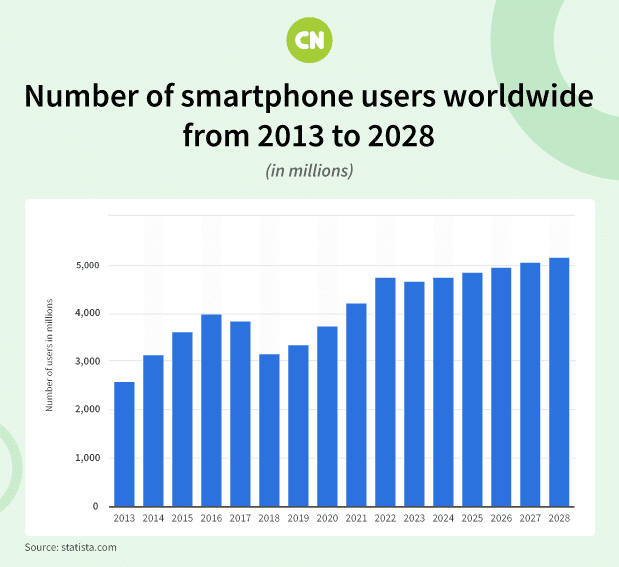
But is this approach still relevant in an ever-changing world? Well, as the number of global smartphone users is increasing rapidly, it is high time to embrace ‘Mobile-First’ design. In this article, we will explore the enduring significance of “Mobile-First” design and its implications for user experience, SEO, e-commerce, and its place in the evolving digital landscape.
The Rise of Mobile Devices
Accessing the internet primarily through desktop computers is now a thing of the past. How we connect to the web has evolved significantly since the introduction of smartphones and tablets. With a projected surge in global smartphone users in the near future, a shift in design principles is necessary to adapt to this new device-centric era.
User-Centric Approach
Placing the user at the forefront of the design process is the main goal of “mobile-first” design. As a large component of a website’s readership, mobile users’ demands should be given priority by designers. Websites created using this method load more quickly, are simpler to use, and offer the best viewing experience on mobile devices.
Prioritizes the Mobile View
Giving the mobile view priority over the desktop view is one of the fundamental principles of “Mobile-First” design. To scale a website to larger displays, designers must create a mobile-friendly version of the site. This strategy ensures mobile users have access to the most important features and material, improving their overall experience.
Search Engine Optimization (SEO)
Google, in particular, favors websites that are mobile-friendly. Google implemented mobile-first indexing in 2021, which means that for ranking and indexing purposes, it predominantly considers the content of a site’s mobile version. This change highlights how critical “Mobile-First” design is to SEO strategy. A website that is optimized for mobile is more likely to appear higher in search results, which will improve organic visitors.
E-commerce and Mobile Commerce
The growth of e-commerce and mobile commerce is undeniable. The convenience of shopping from a mobile device has made it a preferred choice for many consumers. A ‘Mobile-First’ design approach ensures that e-commerce websites are optimized for mobile users, resulting in higher conversion rates and increased sales.
The Future of ‘Mobile-First’ Design
The idea of “Mobile-First” design is growing along with technological advancement. Creating responsive designs that adapt naturally to multiple screen sizes and devices is the current focus of designers. Furthermore, ‘Mobile-First’ design concepts are becoming even more pertinent as a result of cutting-edge technologies like Progressive Web Apps (PWAs), which are obfuscating the distinction between mobile and desktop experiences. Choosing custom ui/ux design within the realm of ‘Mobile-First’ design is key to staying ahead in this ever-evolving digital landscape, ensuring that users across all devices have seamless and engaging experiences.
The Core Principles of ‘Mobile-First’ Design
The core principles of ‘Mobile-First’ design lay the foundation for exceptional web development services. These principles encompass responsive design, fast loading times, intutive navigation, and more. Prioritizing these principles help you ensure your digital product deliver outstanding mobile experiences and meet the need of modern users. Let’s discuss the principles in detail.
- Responsive Design: Websites must adapt to different screen sizes and orientations. It provides a consistent user experience, simplifies maintenance, and accommodates changing device dimensions. Also, it pleases users, who encounter user-friendly layouts, and search engines, boosting SEO rankings. Implementing responsive design ensures accessibility, user satisfaction, and improved online visibility.
- Fast Loading: Mobile users today have an extremely low tolerance for slow-loading websites. In a fast-paced, on-the-go digital world, they expect instant access to information and services. Slow-loading sites frustrate users, leading to quick abandonment and potential loss of business opportunities. To cater to this demanding audience, it’s imperative for web developers and businesses to prioritize mobile optimization and ensure their sites load swiftly, delivering a seamless and satisfying user experience.
- Intuitive Navigation: In today’s digital landscape, prioritizing ease of use on touchscreens is paramount. With an increasing number of users accessing websites and apps on mobile devices, creating intuitive and responsive touchscreen interfaces is essential. Designing with touch in mind means considering factors such as touch target size, gesture support, and user-friendly layouts. By doing so, you can deliver a more engaging and accessible experience that caters to the preferences and expectations of a mobile-savvy audience, ultimately enhancing user satisfaction and the success of your digital product.
- Content Prioritization: On mobile screens, prioritizing critical content is imperative. With limited screen real estate and shorter user attention spans, delivering the most essential information front and center is crucial. Mobile design should focus on clear, concise messaging and intuitive navigation that guides users to what they need quickly. By ensuring that vital content takes precedence, you can create a streamlined user experience that minimizes frustration, improves engagement, and increases the chances of achieving your mobile platform’s goals, whether it’s informing, selling, or entertaining.
- Optimized Images and Media: Compressing images and media is a fundamental strategy for achieving faster loading times on websites and apps. By reducing the file size of images and videos without compromising visual quality, you not only enhance the user experience but also mitigate the risk of users abandoning your site due to slow loading. This optimization is especially critical in the mobile-centric digital landscape, where bandwidth and data usage are often limited. Compressed media ensures quicker loading, reduced data consumption, and a smoother, more accessible experience for users across various devices, ultimately benefiting both user satisfaction and your platform’s performance.
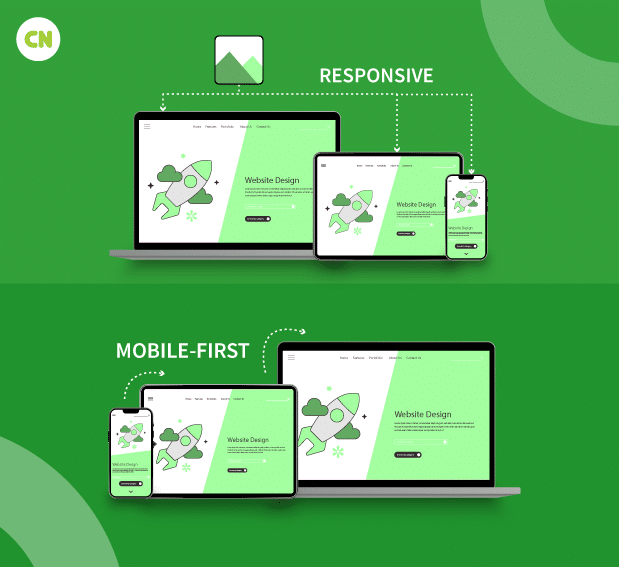
Desktop-first vs. mobile-first
The terms “desktop-first” and “mobile-first” refer to two different approaches in web design and development, specifically regarding how a website or application is designed and optimized for different devices, such as desktop computers and mobile devices like smartphones and tablets. These approaches have evolved in response to the changing landscape of internet usage, where mobile devices have become increasingly popular for accessing websites and applications. Here’s an overview of each approach:
| Mobile-First Approach | Desktop-First Approach |
|---|---|
| In a mobile-first approach, the design and development of a website or application start with the mobile experience as the primary focus. The mobile version is designed and developed first before considering larger screens like desktops. | In a desktop-first approach, the design and development of a website or application primarily prioritize the desktop experience. The website or application is designed with desktop computers in mind as the primary platform. |
| Designers and developers prioritize simplicity, performance, and essential functionality for mobile users. This often involves minimalistic designs, single-column layouts, and efficient use of screen real estate. | Designers and developers create a full-featured, visually rich, and complex user interface that is optimized for larger screens, with features like hover effects, multi-column layouts, and detailed graphics. |
| Once the mobile version is optimized and functional, the design and development team can then progressively enhance the experience for larger screens, adding more features and complexity as necessary. | After the desktop version is complete, the design and development team may then work on making it responsive or adaptive for smaller screens like tablets and smartphones as a secondary consideration. |
| This approach has gained popularity with the growth of mobile device usage and the emphasis on responsive design and performance optimization. | This approach was more common in the early days of web design when mobile usage was less prevalent. |
You May Also Read : 5 Responsive Web Design Mistakes (and How to Avoid Them)
Why Does ‘Mobile-First’ Design Remain Relevant? (Conclusion)
“Mobile-First” design represents a fundamental shift in our approach to web design, not merely a passing trend. It fosters inclusivity by enabling users to access websites from personal computers and mobile devices. Embracing this strategy enhances user satisfaction and company success, given the growing importance of mobile traffic, SEO, and e-commerce.
In 2023, the “Mobile-First” design remains relevant and indispensable due to the surge in mobile devices, its user-centric ethos, its impact on SEO and e-commerce, and its adaptability to emerging technologies. Prioritizing mobile user experience ensures seamless interactions and establishes a robust foundation for success in a perpetually evolving digital landscape. If you haven’t already, it’s imperative to prioritize “Mobile-First” design in your web development strategy.
To achieve excellence in web development and ensure a seamless mobile user experience, it’s imperative to hire web developers well-versed in “Mobile-First” design principles. If you are looking for expert developers, choose capital Numbers. Our developers possess the skills and knowledge necessary to create user-centric, responsive, and performance-driven websites. Want to discuss your project? Book a call today!

 Web Development
 Cloud Engineering
 Mobile App Development
 AI/ML/GenAI
 E-commerce
 Software Development
 UI/UX
UI/UX QA
QA Dedicated Teams


