Loading page…

The client owns a food delivery app that makes doorstep delivery of home-style food easy. This app lists meal providers who make delicious Indian food in an authentic style for NRIs. So, expats who miss home-cooked food can order lip-smacking Indian dishes from this app and satiate their cravings.
Industry
eCommerce
Tech Stack
The client chose Capital Numbers to develop the UI/UX of this food delivery app because we already had a long-standing relationship with the client. We had already delivered DevOps projects for the client previously. So, the client had a deep faith in us.
This time, the client requested us to create a smooth app flow with minimalist UI designs that can make food ordering easy for busy individuals and NRI communities in the USA.
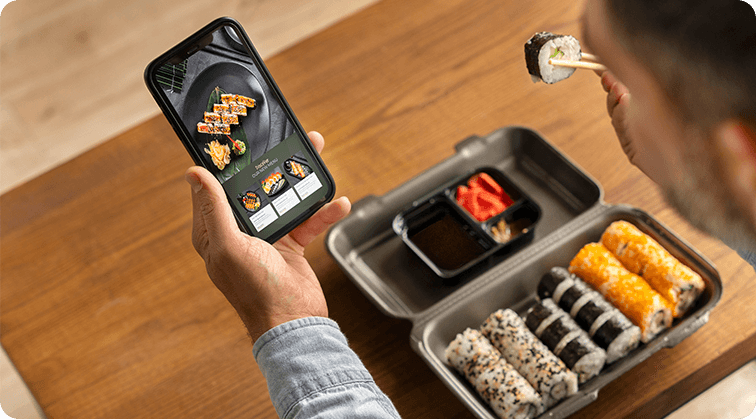
The critical requirement was to create a series of app screens for:
We had to keep all these app screens clean and clutter-free. Moreover, we had to add hi-res images of home-style food to tempt people further to use the app.
Our team had to be mindful not to overburden the screens with non-functional elements. We just had to add the core elements and leave out anything that made the app look crowded. The interface had to be simple but not empty.
We had to use subtle colors and textures to uncomplicate the user experience. We needed to offer enough white spaces to add a sense of minimalism throughout.
We jotted down these vital points and assembled a team of two expert UI/UX designers for the job. Our team started the work by creating a full-blown design prototype of the app screens. We sent the prototype to our client, got the approval, and worked towards turning those design concepts into a tangible reality.
We used Figma to design all the app screens. While developing each screen, we checked whether a user on each screen could accomplish a task properly without wasting time. We saw if every touchpoint in the user journey makes sense.
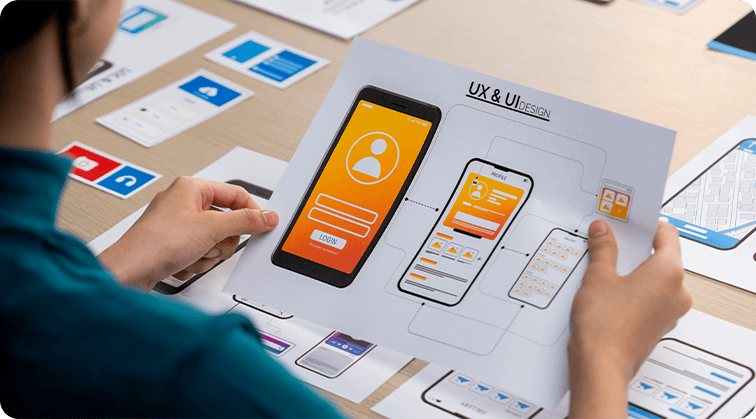
For example, we created a straightforward onboarding screen to help users instantly sign up and save time. We created a simple yet informative menu screen detailing food photos, descriptions, quantity, price, recommended add-ons, and customization options. We added a screen for users to list their concerns and complaints.
While designing these screens, we stuck to the ‘what you see is what you get’ principle. For instance, we used real-looking pictures of ‘thalis’ and ‘combos’ to give a realistic representation. We did not use generic, glamorous food photos because that would mislead users and disappoint them when they receive their meals in cardboard containers. So, we used real-looking food images so users know what they can look forward to.
Although we used contrasting colors, we kept enough white space to keep the overall composition clean. We added a toggle switch to display common Indian food names in English. By adding these elements, we aimed to connect the expat community back to their roots through food.

A final look at the UI designs hugely impressed our client, who quickly replaced their previous designs with our new solutions. Here’s a quick lowdown of the outcomes:
We created a beautiful landing page with high-res images of Indian ‘thalis’ to get mouths watering.
We added a search option to make meal provider discoveries easy and quick.
We created a simple onboarding screen where busy individuals can quickly sign up with their names, emails, and mobile numbers.
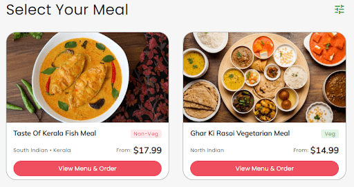
Our eye-catching ‘meal selection’ page highlights chicken, fish, and veg meals that users can choose from.
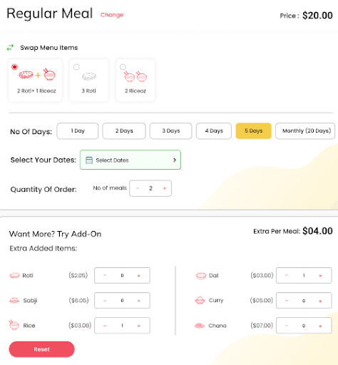
We wanted to save users the headache of cooking meals every week. So, we created a screen for users to order fresh homely meals weekly.
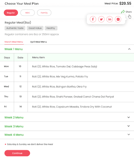
To further personalize experiences, we added another screen for users to add extra items like ‘dals,’ ‘curries,’ or ‘sabzis’ on specific dates.
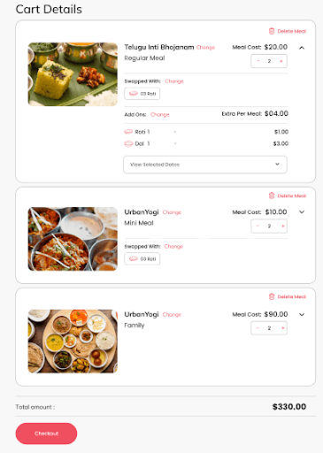
We kept the visual layout of the Cart 100% clutter-free with just the core details like food pictures, names, add-ons, prices, and editing options.
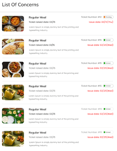
We added another page to help users raise concerns or issues about meal deliveries, boosting user experiences further.
Because we kept enough vacant spaces, we could maintain minimalism and appeal to users’ aesthetic senses.
The minimalism makes the app look lucid and sophisticated.
Our client loves the lucid design as it gives users clarity of thought to fulfill every step without interruption and order their favorite Indian ‘thalis’ without confusion.
Industry: eCommerce

Industry: eCommerce
Industry: eCommerce
Industry: eCommerce
Industry: eCommerce
Industry: eCommerce

Industry: eCommerce
Industry: eCommerce