Loading page…

CASE STUDY
 HTML5
HTML5 CSS
CSS jQuery
 Drupal
The client has a super-specialty hospital. They wanted us to create a brand-new website for them.
The previous website was done by another party in Wordpress, but the user experience wasn’t very good. The branding wasn’t consistent and some of the images didn’t display as they were supposed to.
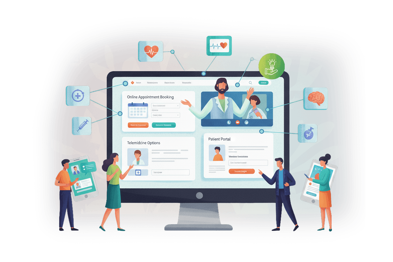
The best part about the app is that the emergency number is right at the top of the Home Page that helps users instantly connect to the hospital authorities and get directions without delay. If the users want to download the app from the Google Play Store, they can simply go to the bottom of the Home Page and download it. The users can find different doctors and their respective departments from the app. If the users have queries, they can send in their questions along with their mobile numbers in a form within the app, and get timely assistance and advice from the doctors. We’ve ensured that all the sections, including ‘About Us’, ‘Specialities and Services’, ‘Patients and Visitors’, ‘Media’, ‘Contact’ and ‘Careers’ have a clear and concise design that helps visitors get all the relevant information whenever they need.
If a patient comes to the site, they might be in a hurry and would need information. So we kept the emergency number at the very top, along with the directions. Someone can click on the directions to pull up Google Maps to show them how to reach their destination. This is so that someone having an emergency can quickly access all the information they need and get medical care as fast as possible.
There are menu items users can use to navigate the site. Sections include “About Us,” “Specialities and Services” “Patients and Visitors” a “Media” section, a “Contact” section, and “Careers.” These menu items lead to drop downs where the user can learn more about each item.
Fill Out the Form and Get Guaranteed Response Within 24 Hours
Expert guidance you can trust. No pitch, just expert solutions.